Visual · Sonic · Verbal
Unfre Identity
An identity isn't a logo. It's a posture — a set of decisions a brand makes about how it looks, reads, and sounds when nobody's watching. The next three chapters are every decision Unfre has already made on your behalf.
Color Palette
Six colors that decide how Unfre feels on every surface — each one given a fixed role in the system.
Click any swatch to copy its hex. Double-click to open a live UI mock and pair it with another color — the combinator scores contrast against WCAG AA/AAA so you can see exactly which pairings hold up in real interfaces.
Borrow a palette
What if Unfre wore your colors instead?
Drop in a photo, a moodboard, a competitor's homepage, your kid's drawing — the lab pulls its five strongest colors and hands them to you. It's a thirty-second way to feel out an alternate version of Unfre before you commit to anything. Click any color to copy hex, or pipe it into the combinator below.
Typography
Two typefaces decide how Unfre reads on the page — a display face for headlines, a body face for everything else.
Type your name, your tagline, your favorite lyric — anything — and watch how the system handles it. It's the fastest way to feel whether Unfre's voice fits the words you'd actually want to put in its mouth.
Heading Typeface
Space Grotesk
Unfre
Light — Headings
Medium — Labels
Semibold — Emphasis
Body Typeface
JetBrains Mono
Unfre
Regular — Body text
Italic — Taglines, quotes
Small — Captions
Composer
What does Unfre look like out in the world?
Type a slogan, a button label, and a second line — and watch them land on a business card, a website, a magazine cover, and a phone screen, all at once. Swap the logo treatment, mess with the words, see how Unfre carries itself across surfaces. Download any one as a PNG and pin it somewhere — it's the closest thing to seeing the brand in real life before it exists.
Logo Concepts
Nine conceptual directions for Unfre, exploring wordmarks, monograms, and geometric treatments.
Each SVG animates as it enters view — a hand-drawing effect that reveals the mark. These are starting points, not finished logos; the final mark would be developed with the acquiring brand team.
Wordmark
The wordmark sets UNFRE in Space Grotesk uppercase tracked-out caps, the doubled UN holding the visual weight on the left, the FRE clipped tight on the right. Locks up cleanly against deep wine charcoal #1F1518 backgrounds for the working catalog cover, on warm white #FAFAFA for the storefront site sign, and as a single foiled line across the spine of the trade-account binder. The mark reads as working type on a working surface.
Square Monogram
The square monogram nests UN over FRE on two stacked lines inside a claret red #8B2D4A ground, with the surrounding deep wine charcoal #1F1518 handling the corner detail. Built for working surfaces the wordmark cannot reach — the favicon on unfre.com, the corner of the working repair voucher card, the rivet stamp on the inside seam — without losing the working register at small scale.
Initial + Accent Bar
The initial-and-accent-bar treatment runs a single claret red #8B2D4A horizontal rule beneath a Space Grotesk uppercase U, used on editorial pages of Unfre Quarterly where a section opener wants restraint rather than emphasis. The rule echoes the section dividers used inside the working catalog, holding the editorial register consistent across surfaces.
Circle Monogram
The circle monogram sets U·N inside a deep wine charcoal #1F1518 disc on warm white #FAFAFA, used on circular surfaces — the working seal embossed on the trade-account box, the rubber repair-stamp on the inside hem, the small enamel pin issued to working storefront staff. Reads as a working maker's mark rather than a marketing logo.
Split Logotype
The split-logotype treatment breaks UN / FRE across two lines, each line tracked out in Space Grotesk caps, with a claret red #8B2D4A hairline between. Used in vertical formats — the spine of Unfre Quarterly, the long-edge of the storefront site sign, banner placements on the working catalog — where the mark needs to fill a tall space without being stretched.
Slash Mark
The slash mark renders the brand as UN/FRE, the slash drawn in claret red #8B2D4A at the same weight as the Space Grotesk stem. Used in working metadata contexts — file footers, code comments in the brand's working software systems, internal email signatures — where the mark wants to be present without claiming the typographic foreground.
Code Brackets
The code-bracket treatment sets [UNFRE] in JetBrains Mono uppercase inside square brackets, with the brackets in deep wine charcoal #1F1518. Built specifically for working developer-facing surfaces — the working API documentation, the working repair-portal source comments, the unfre.com source-view footer — where the mark needs to read as working monospace inside a code context without breaking it.
Vertical Stack
The vertical stack arranges U / N / F / R / E across five lines, each letter separated by a claret red #8B2D4A dot, used at architectural scale — the storefront-network site sign, the printed banner inside the trade-account box, the back cover of Unfre Quarterly. The stack reads as a working vertical wordmark while keeping every letter visible at scale.
Ring Monogram
The ring monogram circles UN with a claret red #8B2D4A ring on warm white #FAFAFA, with the year of the working garment lot set in JetBrains Mono small-caps inside the ring. Used on apprentice-graduation pins, anniversary marker plates for working storefronts, and the printed working-cohort certificates — surfaces where the year is part of the mark's working meaning.
Build your own
Lockup Playground
Ever wonder how the Unfre mark would feel on a hat, a hoodie, a sticker, an app icon?
Drag the wordmark and the mark wherever you want. Swap the shape under them, change the surface, scale each piece up or down — then export your version as a PNG. None of this is the "official" answer. It's a sandbox so you can feel out how Unfre behaves under your own hands before the brand even has owners.
Drag either piece. Use the sliders to resize.
Brand Voice
A three-step way to feel out how Unfre sounds — read it, hear it, then pick it.
The voice is one of the things you can't see in a screenshot. So we built three small ways to put it in your ear: a written line, a real recording, and a blind test where you decide which take feels most like the brand.
Read it
A line Unfre would actually say. Notice the cadence before you notice the words.
“Unfre says what it means. No hedging. No throat-clearing. Sentences are short. Verbs do the work. The voice has opinions about clothing — that most of it is built to fall apart, that repair is cheaper than replacement, that the buyer can handle directness. It tells the truth about the product.”
Hear it
Now in a real voice. Different speaker, same character — that's the test of whether the voice holds.
Pick it
Two takes, no labels. Trust your ear — we'll reveal who's behind each one after.
Which voice sounds more like Unfre to you?
Two voices read the same line. We're keeping the names hidden on purpose — pick whichever one feels like Unfre in your gut, and we'll reveal who's behind each take after. There's no wrong answer; the test is really just a way to hear the brand take shape in your own ear.
Listen to both, then pick.
A spec, not a vibe
Voice Guidelines
The Unfre voice is blunt. Short sentences. Verbs do the work. No hedging. No throat-clearing. The brand has opinions and states them. The discipline is to write the way a working tradesperson talks about working tools: plainly, with strong opinions, and without wasting the reader's time. A useful working rule: if a sentence could be removed without losing meaning, remove it.
Short sentences. Sometimes very short.
Verbs over nouns. Concrete over abstract.
No hedging. No 'one might consider.'
Contractions are mandatory.
Numbers when sourced. Hedged when not.
Strong opinions, plainly stated.
On voice · Off voice
Most workwear is built to fail. Not built poorly. Built to a price.
The contemporary workwear market suffers from a structural emphasis on price-point optimization that often comes at the expense of long-term durability outcomes.
On-voice diagnoses the problem in eight words across three sentences; off-voice takes twenty-six and lands nowhere.
Buy once. Wear for years. Mail it back when something gives.
Customers can leverage our innovative lifetime repair program to extend the working life of their workwear investment over multiple seasons.
On-voice gives instructions; off-voice gives a marketing paragraph that says less in more words.
The construction is what the construction has to be. Cotton canvas, ten ounces minimum. Double-needle seams everywhere.
Our garments feature premium cotton-canvas construction with reinforced seam architecture designed to maximize working durability.
On-voice tells the working buyer the spec; off-voice tells the marketing director that the spec exists.
The repair is part of the price.
Our innovative pricing model bundles ongoing maintenance services into the initial purchase to deliver superior total cost of ownership.
On-voice says the thing in seven words; off-voice translates the same thing into MBA dialect.
Procurement officer. Three-year contract. The math is the math. Unfre is cheaper.
We invite procurement professionals to evaluate Unfre's compelling value proposition through a multi-year total-cost-of-ownership analysis.
On-voice trusts the procurement officer to follow short sentences; off-voice underestimates the reader.
Sonic Identity
How Unfre Sounds Across Industries
10 radio ad concepts — one for each industry Unfre is positioned in.
Each script shows how the brand voice can adapt to different audiences while staying unmistakably Unfre. Visitors often spend a long time here, clicking through ads, smiling at the ones that land. That's the point — every listen is a small deposit in the brand's familiarity, and that familiarity accrues to the owner.
Trade & Working-Apparel
View industry →“Unfre. Built to outlast the fraying. Buy a coverall once. Wear it for six years. Send it back for the seventh. unfre.com.”
Healthcare & Hospital Workwear
View industry →“Old way: a new set of scrubs every nine months. Bin the old. Buy more. New way: one set. Six years. Repair voucher in the hangtag. Unfre Clinical. unfre.com.”
Repair-First Mending Service
View industry →“It is the end of the working day. The coverall has a hole in the knee. The fabric is fine. You drop it at the Unfre counter on the way home. You pick it up Friday. Stamp on the inside hem. unfre.com.”
Restaurant & Kitchen Workwear
View industry →“Working line cook, three-year veteran. She used to go through six chef coats a year. Now she has one. It has been on the line for fourteen months. She knows the repair stamp by heart. Unfre Kitchen. unfre.com.”
Farming & Field-Work Apparel
View industry →“It is six in the morning. You are walking out to the barn. The bib overalls are five years old. The seam is stamped. The hammer loop is intact. You go to work. Unfre Field. unfre.com.”
Industrial & Trade B2B Wholesale
View industry →“Procurement officer. Three-year contract on the table. The math is the math. Unfre is cheaper because the garments last. Read the quarterly report. unfre.com.”
Children's Built-To-Last Apparel
View industry →“How many coveralls did your kid go through last year? How many will the next one go through? Buy one Unfre. Hand it down. Stamped, repaired, and ready. unfre.com.”
Repair Culture & Anti-Disposability Editorial
View industry →“When did the repair conversation become a marketing trend? Probably when nobody was actually doing the repairs. Unfre Quarterly publishes the work. unfre.com.”
Apprenticeship & Trade-School Apparel Programs
View industry →“Old way: first day on the job, bad coveralls, blow out by month two. New way: apprentice bundle, day one, repair voucher in the hangtag. Unfre Apprentice. unfre.com.”
Studio & Creative Working Apparel
View industry →“Unfre Studio. Built where the work is. Studio coat — replaceable cuffs. Studio apron — replaceable neck strap. Studio pant — built to outlast the bench. unfre.com.”
How the name scales
Brand Architecture
One brand name, many product surfaces — and a pattern that decides how each one gets named.
Architecture is the part nobody sees until it's broken. Get it right and Unfre can extend into ten verticals without any of them feeling like an afterthought. Get it wrong and every new product needs a new round of naming.
The pattern
Unfre + [working noun]
Every Unfre product, program, or sub-brand is named by appending a single working noun to the parent name. The pattern resists portmanteau coining and forces every line to stand on its working noun rather than on a marketing flourish. A working tradesperson reading the catalog should know what the line covers without any explanation.
Rules
- Parent name first. Always Unfre, never abbreviated.
- Working noun second. One or two plain English words.
- Capitalize the working noun the way it would normally be capitalized.
- No portmanteau coining. No invented suffixes.
- Modifiers follow the noun if needed (Unfre Kids Coverall).
- Internal codenames may shorten during development. Public mark stays full Unfre.
Examples
Unfre Trade Coverall
the flagship working coverall
Unfre Working Pant
the heavy cotton-canvas working pant
Unfre Kitchen
the line of working kitchen apparel
Unfre Clinical
the line of working clinical scrubs
Unfre Field
the line of farm-and-field working apparel
Unfre Industrial
the B2B program for industrial uniform contracts
Unfre Kids
the children's built-to-last working line
Unfre Apprentice
the apprentice cohort bundle
Unfre Studio
the working creative-studio line
Unfre Quarterly
the editorial magazine
Brand Applications
Directional mockups showing how Unfre could appear across physical and digital touchpoints.
Treat these as imagination fuel, not a visual mandate — each one is a spark for what you might build, a reference for what a designer could run with, and a piece of ambient storytelling for visitors who stop by and picture the brand in the world.
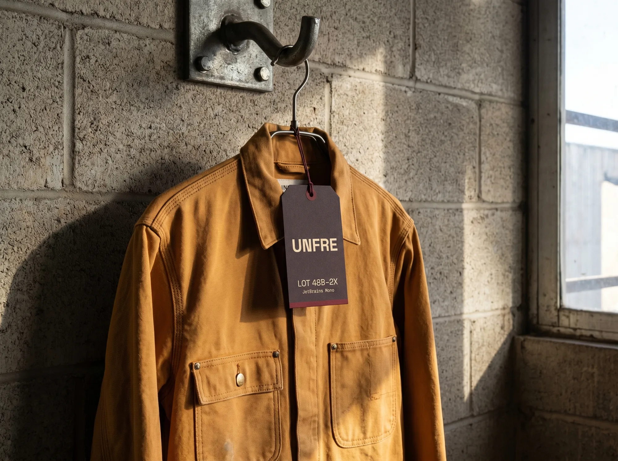
Durable Coverall & Hangtag
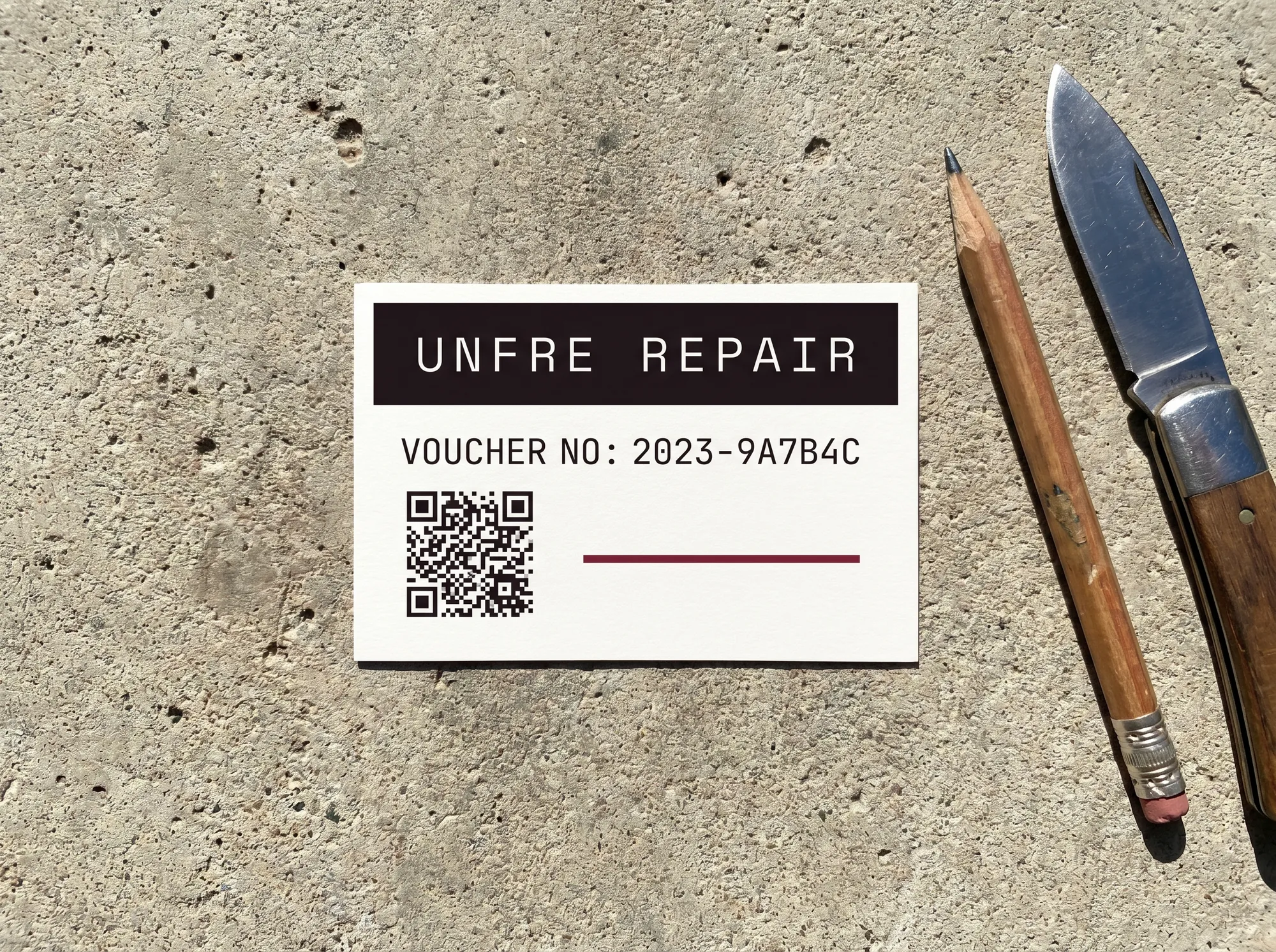
Repair Voucher Card
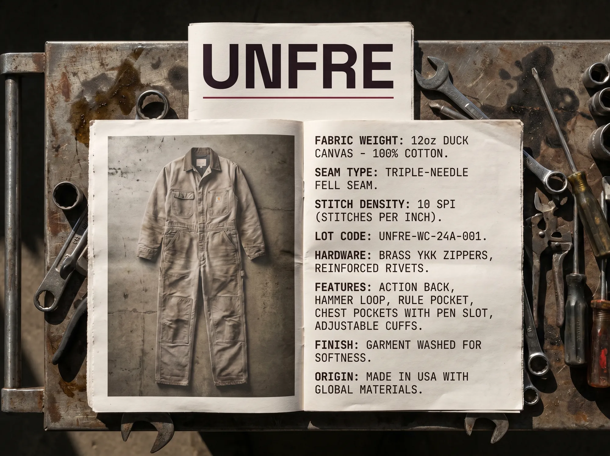
Workwear Catalog — Working Spec Sheet
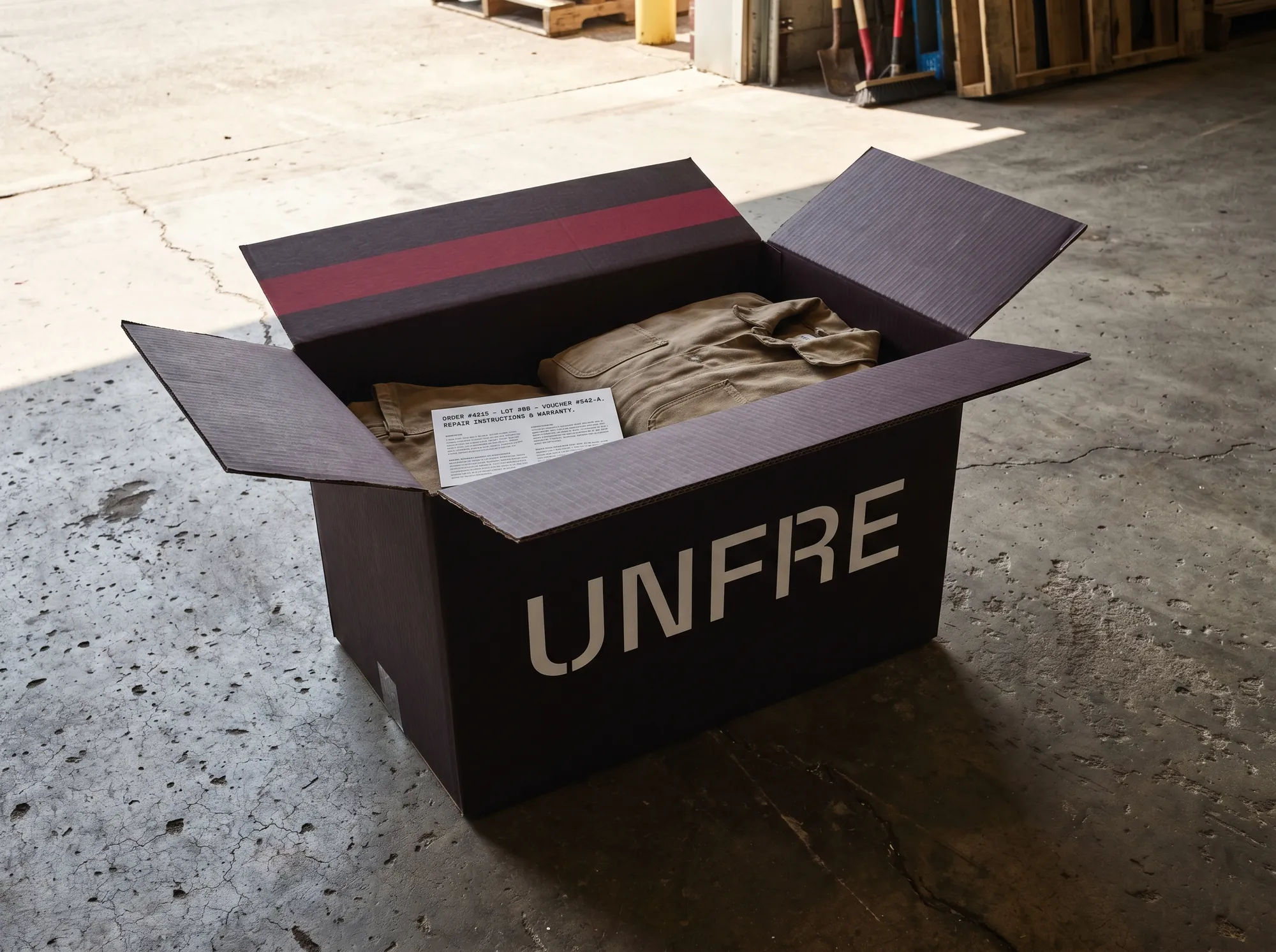
Trade Account Box
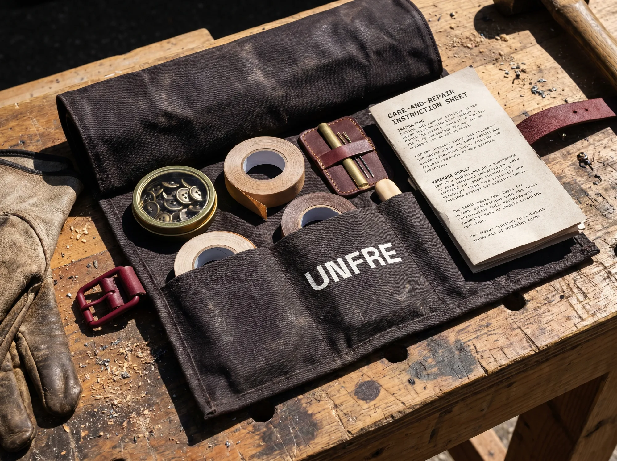
Site Workwear Kit Roll
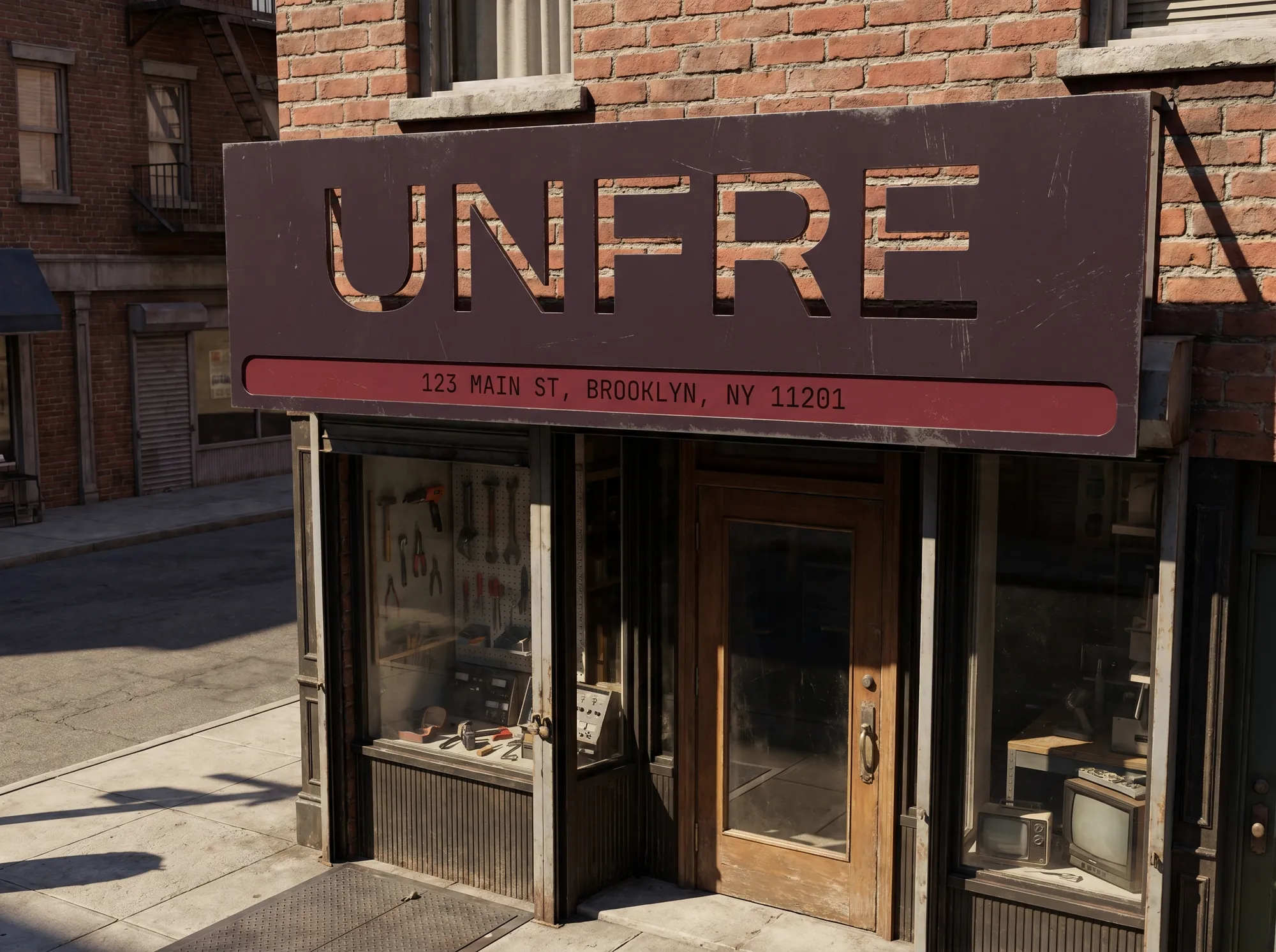
Storefront Site Sign
These mockups aren't a mandate — pick a posture:
The mockups exist to seed possibility — for you, and for every curious visitor who lands here and starts imagining Unfre as a real thing.
Visual Tools
Two interactive ways to bend Unfre toward your direction — and walk away holding something tangible.
Remix one of the mockups above, or compose a hero card from scratch. Both export as PNGs you can drop into a deck, share, or pin to your desktop. Visitors who build something here tend to remember the brand — that's the whole point.
Make a Unfre mockup that's yours
Pick any mockup, swap the colors, rewrite the line — and download the remix. Ten seconds, one PNG.
Drop Unfre on a poster, a billboard, or a slide
Headline, backdrop, layout — compose a 1200×900 share card and walk away with something tangible.
Built to outlast the fraying.
Unfre says what it means. No hedging. No throat-clearing. Se